
A picture can say a thousand words, or in this case, dollars
written by NWHF Board Treasurer Jo Davis
After a decade of serving on nonprofit boards and finance committees, I’ve reached a definitive conclusion: financial health is what happens when technical data and human intuition have a very productive coffee date.
Let’s be real. The term “fiduciary responsibility” is just a terrifyingly fancy way of saying don't let the ship sink. Over the years, I’ve been the person in the room who was lost and overwhelmed, and the person leading the conversation. I’ve learned that a high-functioning finance committee isn't just about the numbers; it’s about building a bridge between the spreadsheets and the humans who oversee them.
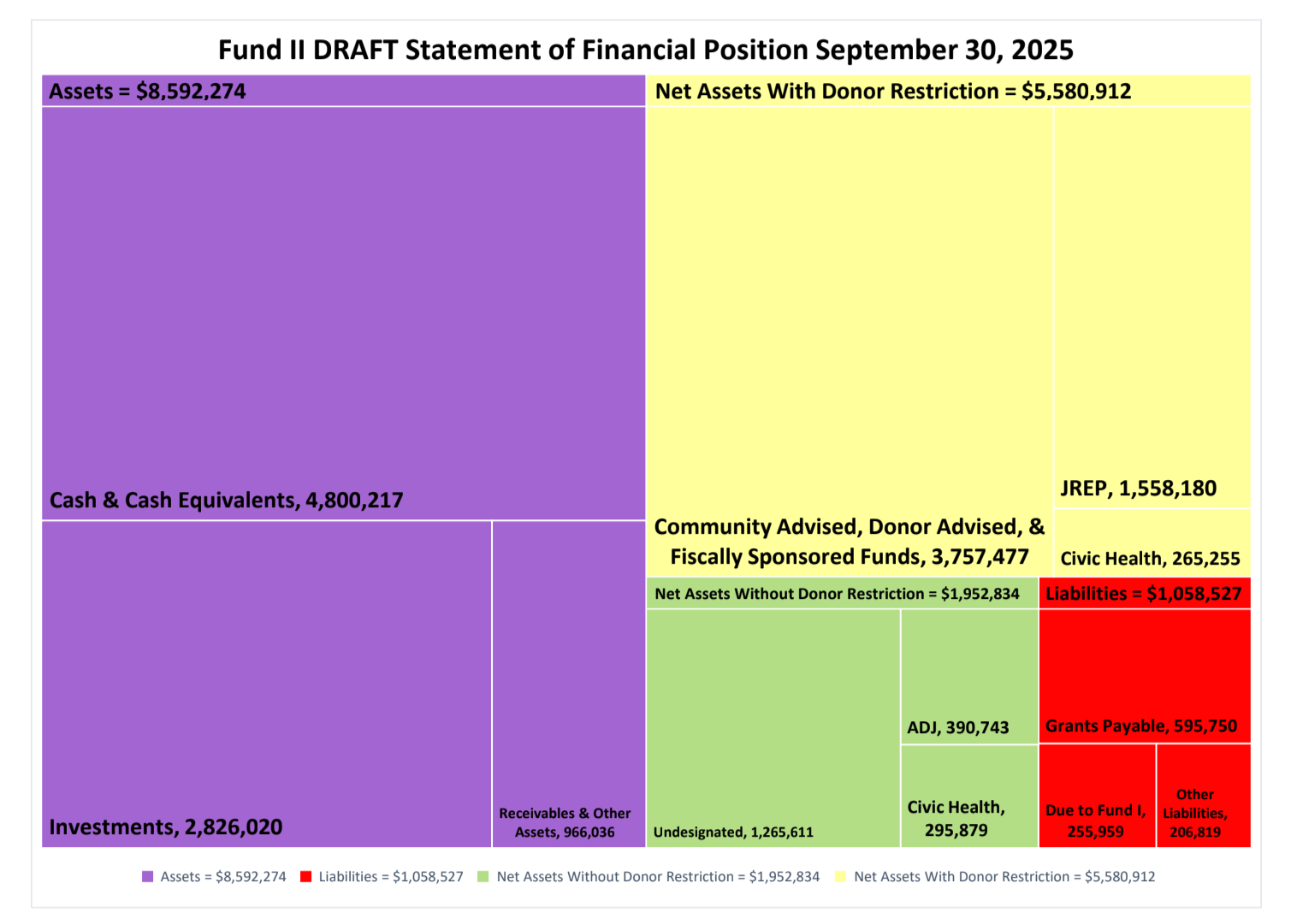
At NWHF, we build that bridge through layered reporting. This means providing visual dashboards for the big picture and using narratives that skip the acronym-heavy secret language of accounting. We create space for people who aren’t finance experts to contribute and engage in a meaningful manner. Part of our secret sauce is a color-coded Statement of Financial Position. It takes a document that usually looks like code from the Matrix and turns it into a visual treemap that uses spatial reasoning to tell our story.
Why is this better than a 20-tab Excel workbook?
Visual Scale: The size of the boxes shows the big picture immediately. You can see at a glance that our assets (shown in purple $8,592,274) are much larger than our liabilities (shown in red $1,058,527), which gives an instant sense of the organization's stability.
Clear Categories: The colors act as a map for our funds. Yellow shows the money earmarked by donors for specific projects ($5,580,912), while green shows our unrestricted funds available for general use ($1,952,834).
Visual Math: It physically proves the equation assets = liabilities + net assets,
because the boxes on the right side of the screen fit perfectly into the total area on the left.
In this format, you see the reality check right away: if we paid off every red-box liability today, the yellow and green boxes are exactly what would be left. It makes balancing the books a tangible reality rather than an abstract math problem.
By replacing walls of text and endless rows of numbers with shapes and colors, we can include people with various learning styles and can drastically ease the fight or flight response many of us feel when staring at traditional spreadsheets. This is the curb-cut effect in action! While these visuals are vital for accessibility, they’re also a massive relief for anyone who wants to understand the financials without sweating profusely.
My board peer Jason Mcneal Graham agrees, this tool “helps us all understand that financials are narratives and these stories aid us in moving with direct action and meaningful support both into and throughout the communities we are of, and this is essential. Thank you Team NWHF for creating multiple translations into this unnecessarily and intentionally complex language of systems relationship to resource.”
Want to try this for your team?
Here is an Excel template with instructions on how to create a balance sheet treemap courtesy of our Director of Finance and Operations, Anita Rodgers.
Happy coloring!
This is the third blog in a series about nonprofit finance. If you liked this blog, we encourage you to go back and read the first two: